Accordion panels are a trendy design feature often seen on websites. these are helpful for grouping information and for increasing the user experience of your website. We’ll explain how to make these amazing panels on your own website in this blog post. It’s simpler than you think. We’ll take you through it step-by-step and explain the code we provide so you can use it simply in your personal web projects.
Table of Contents
HTML Structure:
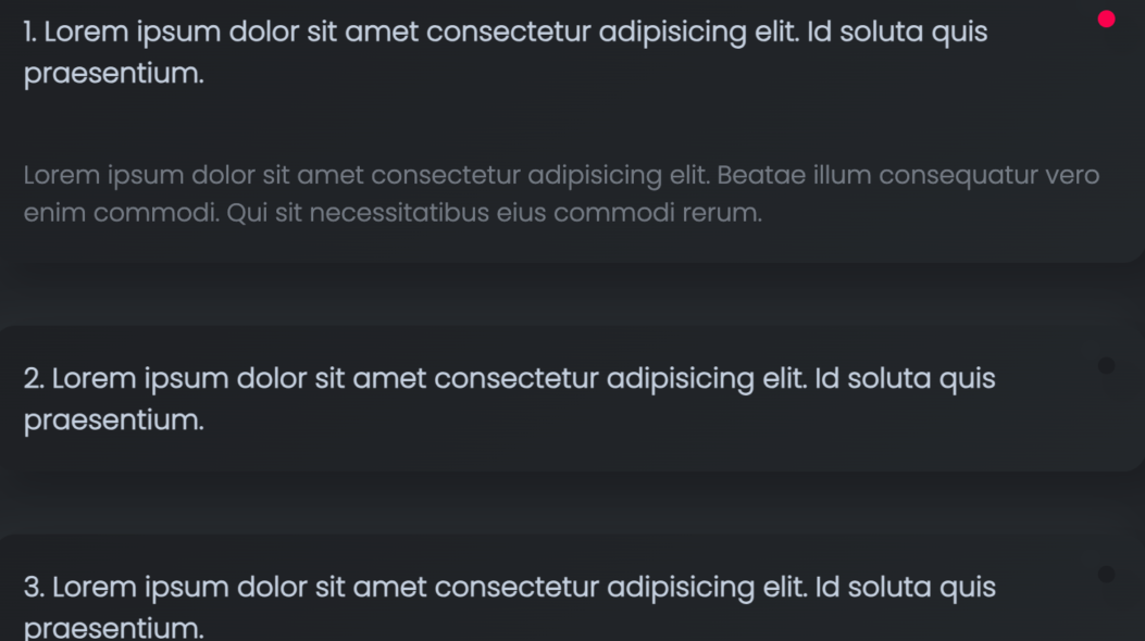
The HTML structure defines the content that will be displayed within the panels. In this example, we have three items, each consisting of a question and an answer:
<section class="example1">
    <h2 class="heading">Example 1</h2>
    <div class="accordion">
        <div class="question">
            <h3>1. Here is the question</h3>
        </div>
        <div class="answer">
            <p>Here is the Answer.</p>
        </div>
    </div>
    <!-- more similar accordion panels -->
</section>
CSS Styling:
The CSS code is responsible for styling the HTML. It sets the background color, and font styles, and adds a shadow effect to create a visually appealing design. The critical CSS classes include .accordion, .accordion h3, .accordion::after, and .answer, as described in the following code:
section.example1 {
display: flex;
background-color: #212428;
justify-content: center;
flex-direction: column;
}

section {
    width: 100%;
    margin: auto;
}

h2.heading {
    font-size: 1.5rem;
    color: #c4cfde;
    font-family: 'Poppins', sans-serif;
    text-align: center;
    padding: 20px;
}

.accordion {
    border-radius: 15px;
    background: linear-gradient(145deg, #1e2024, #23272b);
    box-shadow: 10px 10px 19px #1c1e22, -10px -10px 19px #262a2e;
    position: relative;
    margin: 20px 0;
}

.accordion h3 {
    font-size: 1.1rem;
    color: #c4cfde;
    font-family: 'Poppins', sans-serif;
    padding: 20px;
    cursor: pointer;
}

.accordion::after {
    content: '';
    display: block;
    position: absolute;
    right: 20px;
    top: 20px;
    width: 11px;
    height: 11px;
    border-radius: 100%;
    background-color: #1c1e22;
    box-shadow: 10px 10px 19px #1c1e22, -10px -10px 19px #262a2e;
}

.accordion.active::after {
    background-color: #f9004d;
}

.accordion p {
    font-size: 1rem;
    color: #c4cfde;
    font-family: 'Poppins', sans-serif;
    opacity: .5;
    padding: 20px;
}

.answer {
    overflow: hidden;
    height: 0;
    transition: .5s;
}JavaScript Functionality:
The JavaScript code provides the interactivity for the panels. It toggles the visibility of the answer when a question is clicked. Here is how it works:
let mainParent;
let height;
let answer;
const accordion = document.querySelectorAll('.accordion h3');

accordion.forEach((item) => {
    item.addEventListener('click', () => {
        mainParent = item.parentElement.parentElement;
        answer = item.parentElement.nextElementSibling;
        height = item.parentElement.nextElementSibling.firstElementChild.offsetHeight;

        if (mainParent.classList.contains('active')) {
            mainParent.classList.remove('active');
            answer.style.height = `0px`;
        } else {
            mainParent.classList.add('active');
            answer.style.height = `${height}px`;
        }
    })
});
Explanation of JavaScript Code:
- We select all the h3 elements within elements with the class .accordion and store them in the accordion variable.
- We add a click event listener to each h3 element.
- When a question is clicked (item.addEventListener(‘click’, () => {…}), the code does the following:
- It identifies the parent elements of the clicked question using item.parentElement.parentElement.
- It calculates the height of the answer (height) by accessing the first child element of the next sibling (item.parentElement.nextElementSibling.firstElementChild).
- If the parent element has the class active, it removes the class and sets the answer’s height to 0px, effectively hiding it.
- If the parent element does not have the class active, it adds the class and sets the answer’s height to its calculated height, revealing it.
Example 2
Use this script if you want to display one open card at a time and the rest will close automatically.
Note: I have changed the variable name in this script code, so please change it as per usage: In this js code, we are first checking whether the class is present or not, this will work as toggle functionality After that we will change the active class removing from parent list and add to active class where user clicked
let mainParent2;
let height2;
let answer2;
const accordion2 = document.querySelectorAll('.accordion2 h3');

accordion2.forEach((item) => {
item.addEventListener('click', () => {
    mainParent2 = item.parentElement.parentElement;
    answer2 = item.parentElement.nextElementSibling;
    height2 = item.parentElement.nextElementSibling.firstElementChild.offsetHeight;

    if (mainParent2.classList.contains('active')) {
        mainParent2.classList.remove('active');
        answer2.style.height = `0px`;
    } else {
    // Loop through all accordion items and remove the 'active' class
    accordion2.forEach((accordionItem) => {
        const parent = accordionItem.parentElement.parentElement;
        const answer = accordionItem.parentElement.nextElementSibling;

        if (parent.classList.contains('active')) {
        parent.classList.remove('active');
        answer.style.height = `0px`;
        }
    });
    // add active
    mainParent2.classList.add('active');
    answer2.style.height = `${height2}px`;
    }
})
})